The onCourse Dashboard
The dashboard is the opening window of onCourse; it is the first thing you will see on your screen after you successfully login. The dashboard is made up of a three-column view window with a collapsible, global navigation quick access column containing favourites, categories & latest activity. Enrolments, revenue and automation status live in the middle, and onCourse news on the right. There is also a logout button, a button to change your visual themes and, in some cases, an Upgrade to onCourse Pro button for anyone using the free version of the software.
Columns can be resized by hovering your mouse over one of the cut-off lines, then clicking and dragging either left or right to decrease or increase the size of the column. You can also resize the browser window by hovering your mouse over the bottom-right corner, or the left or bottom edges of the window, then clicking and dragging to resize it.
The global navigation column can be collapsed by clicking the x in the top-left.
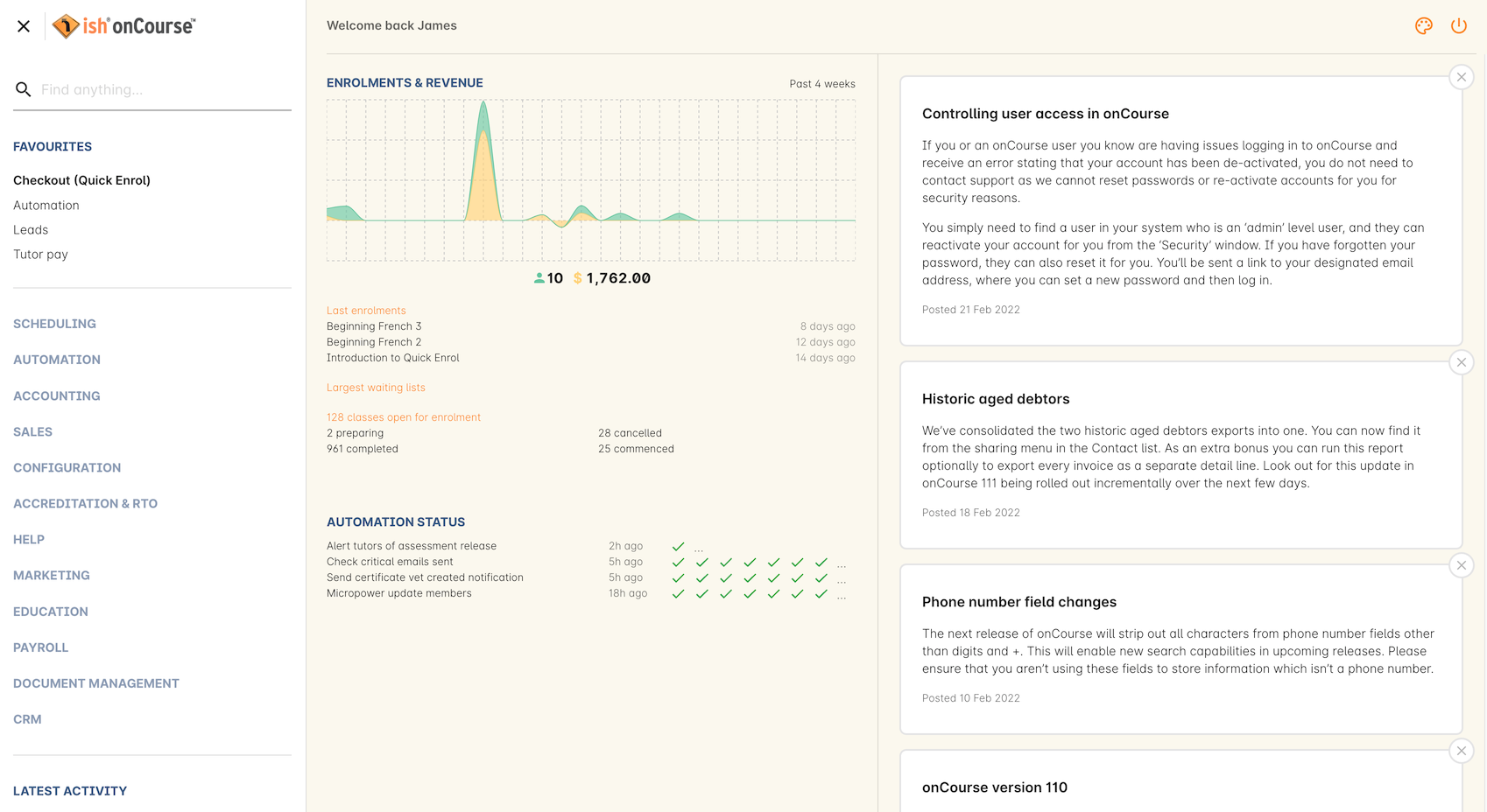
Figure 1. The onCourse Dashboard
Global Navigation
This is the left most column that appears on the dashboard. This column can also be accessed in numerous other windows in onCourse, allowing you to quickly access any part of the application in just a few clicks. Click the burger icon in the top left to display the column if it’s hidden. Click the x to collapse it.
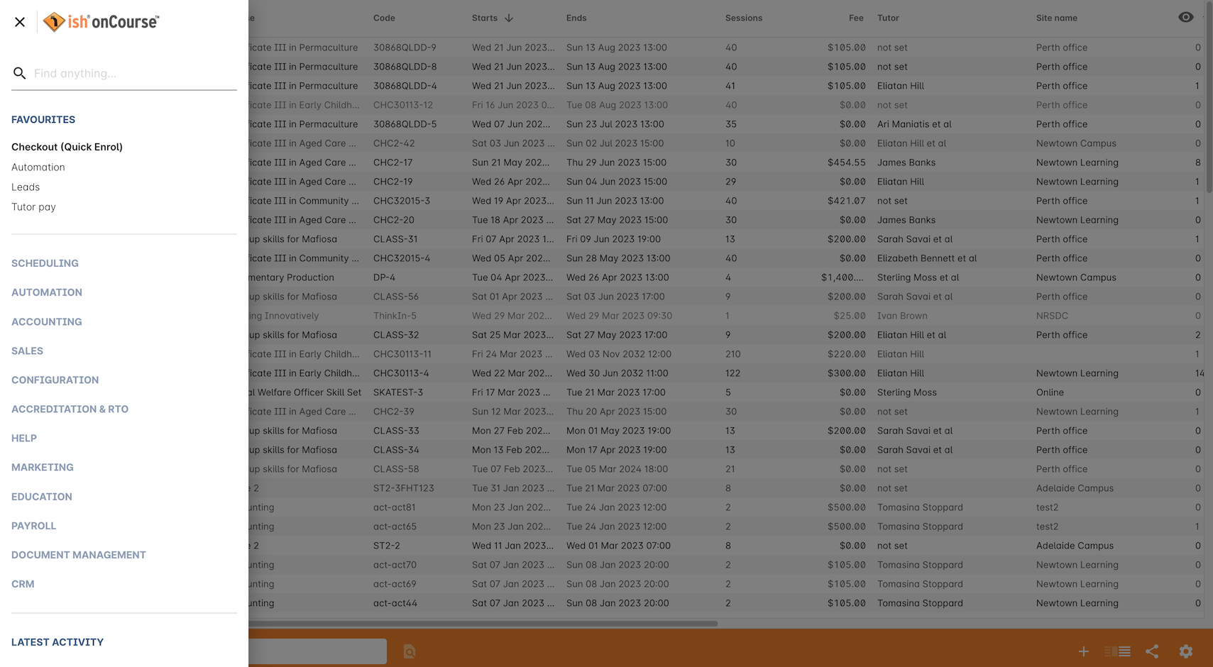
Figure 2. The global navigation column in the Classes window
Favorites
Favourites is the best way to gain one-click access to almost all the different areas of the application.
Initially, Favorites will only show Checkout. Click into a category and select the heart icon that appears when hovering your mouse over a selection to add that window to your favourites.
Your favourites will always appear at the top of the global navigation, and it will always contain Checkout.
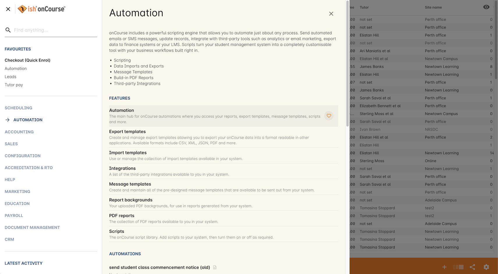
Figure 3. Adding the Automation window to my Favourites in navigation
Categories
Each window in onCourse is grouped by category to better give users an idea of what can be achieved in onCourse. Some windows may appear in multiple categories.
Click on a category to expand it. You’ll see a full description for each category, as well as descriptions for each section in onCourse.
The categories are:
- Scheduling
- Automation
- Accounting
- Sales
- Configuration
- Accreditation & RTO
- Help
- Marketing
- Education
- Payroll
- Document Management
- CRM (Customer Relationship Management)
Latest Activity
This section appears below the categories. It will save and then display a history of the most recent records you’ve interacted with, including during previous logins, acting as a quick way to revisit screens you were just using. You can click any of the displayed windows or records to go directly to it.
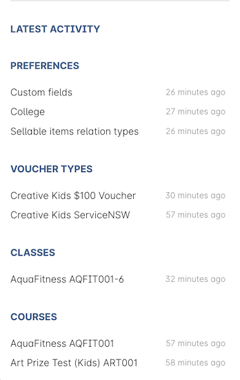
Figure 4. The Latest Activity column
Automation Status
This section shows you whether your most recent automation tasks were successful in executing or not. It will only show to users with a user role that allows the viewing of audit logging.
Hover your mouse over a tick or cross icon to learn the time of execution (or failure), or click the ellipsis (…) to see the audit logs for that script.

Figure 5. This sections shows whether your most recent automation tasks were successful or not
On Demand Automations/Scripts (Admin only)
On Demands Automations appear only for admin users, and can be triggered manually from the Automation category on the Dashboard. They will appear here when three conditions are met:
- The script is set as on demand
- The script has no related entity
- The script is enabled
You can learn more about automation scripts in general by going to our Automations chapter.
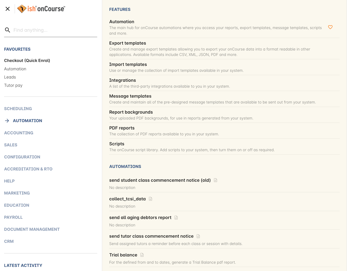
Figure 6. On Demand scripts appear at the bottom of the Automations category in the navigation.
Find anything
At the top of the Dashboard, you’ll find a powerful search box called Find Anything. Here you can find all manner of data in onCourse and have it accessible at your finger tips with only a few keystrokes. Simply type in what you’re looking for, be it a contact’s last name, a course code or even an invoice number and the search results should populate as you type, filling out with any matching result. You can also search contacts using email address or phone number.
The results should in order of newest to oldest record. It will only show a small handful of results at first. Click 'View more' to see the full list.
Feel free to experiment with what you can search for, it covers a lot of data!
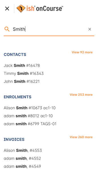
Figure 7. Find Anything will help you find almost anything within onCourse quickly
Enrolments & Revenue
This column will give you a simple, graphical representation of your recent enrolments and revenue from the past four weeks in an easy-to-read graph. As well as the visual graph, you’ll also see the raw numbers of enrolments and revenue, as well as a breakdown of the number of courses you have set up in the system.
The course breakdown will show you the last courses enrolled in, the courses with the highest number of people on a waiting list, the number of courses open for enrolment, and a detailed look at the number of courses currently classed as in development, cancelled, commenced and completed.
This can be hidden from other onCourse users by turning off their Invoice view permissions in User Roles
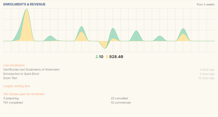
Figure 8. The Enrolments & Revenue Column
onCourse News
This section shows the latest posts in the onCourse blog, and will also be updated with news about everything onCourse.
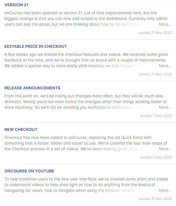
Figure 9. onCourse news will update every time you log in to the application
Themes & Log Out

Figure 10. The Themes and Logout icons.
In the top-right of the Dashboard there are two new icons, Themes and Log Out. Log Out is self-explanatory, click this to log yourself out of the system and return to the main login page.
Themes will allow you to select a visual theme for the application from those that are currently available, Light, Dark & Monochrome. This setting is saved for each user, so if multiple users use onCourse on the same computer, it will remember their preferred setting.
The current available themes are:
Light
the standard orange & tan theme you see throughout most of the screenshots in this manual.
Dark
A dark background with light fonts
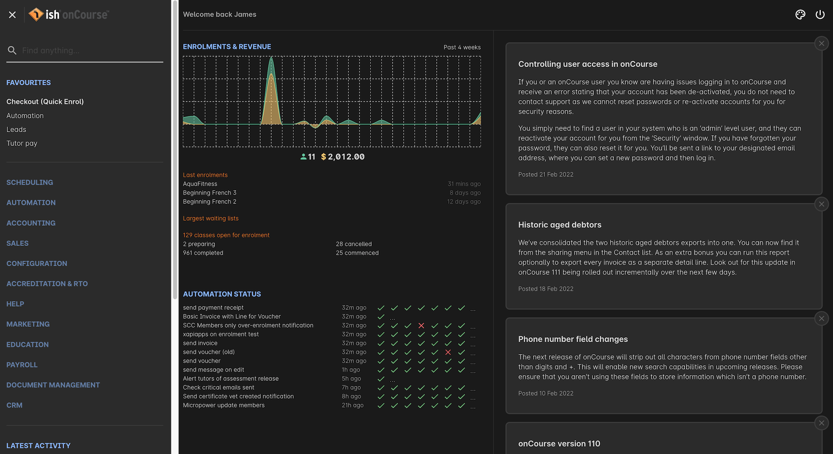
Figure 11. The Dashboard as it looks with the Dark theme
Monochrome
A light theme that’s mostly while backgrounds with dark text
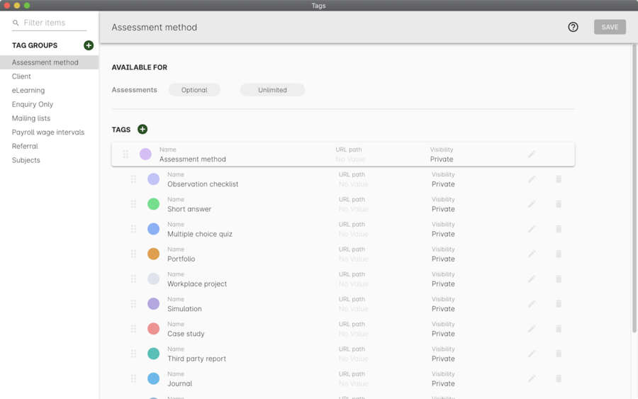
Figure 12. The Tags window using the Monochrome theme
High Contrast
Similar to Monochrome except makes more use of darker titles and some backgrounds.
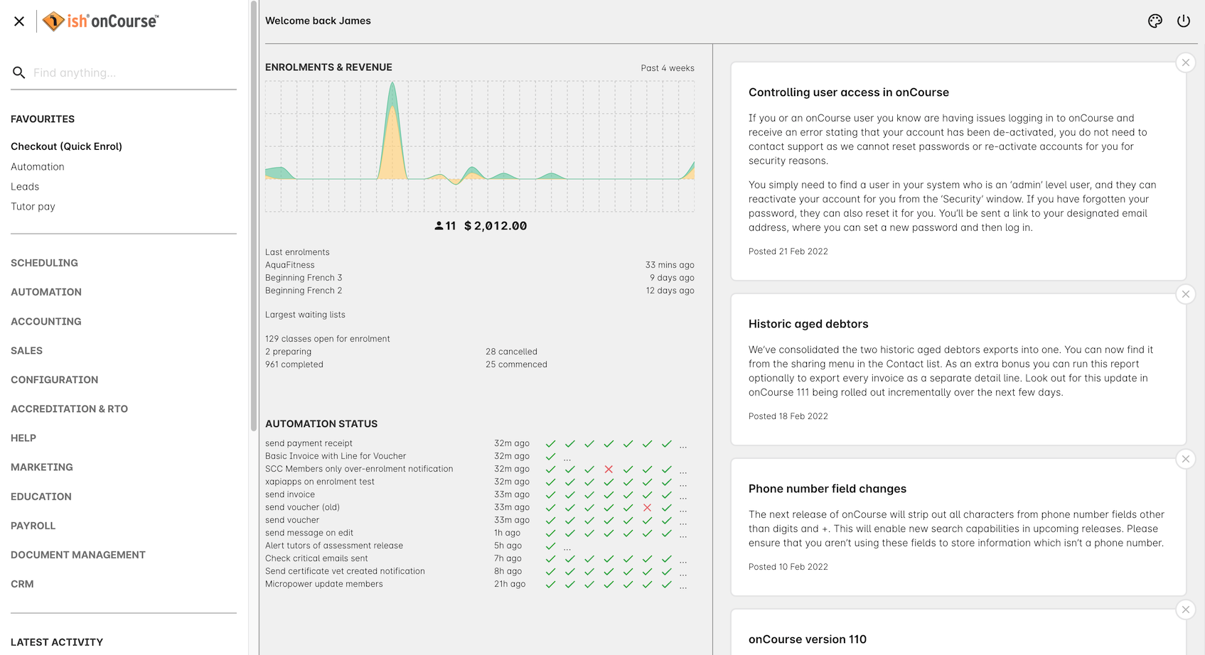
Figure 13. The High Contrast theme
Updated almost 2 years ago
